Case Study: Design frameworks, coherence & alignment
Senior Product Designer at Microsoft, Skype Division
I facilitated the visual and interactive alignment of the Skype user interface to create a cohesive and consistent user experiences across multiple endpoints (desktop, web, mobile, tablet & large screen experiences such as TV and Surface Hub).
Summary
There were roughly 27 platforms/versions of Skype available to customers, including consumer electronics and TV manufacturers. Many of them had different experiences depending on when, where and who they were developed by.
There was a lot of UI, visual and technical debt to work with. We wanted to clean things up and align the core experiences better. This would mean we can design once, and concentrate more on new features and functionality customers would love.
We often duplicated effort and needed to improve cross-platform use and usability of our products for our users.
Common design framework
We needed to design a framework, a collection of UI patterns, that could be used as a guide to govern what the product looks like and how the product acts across all end points.
Approach
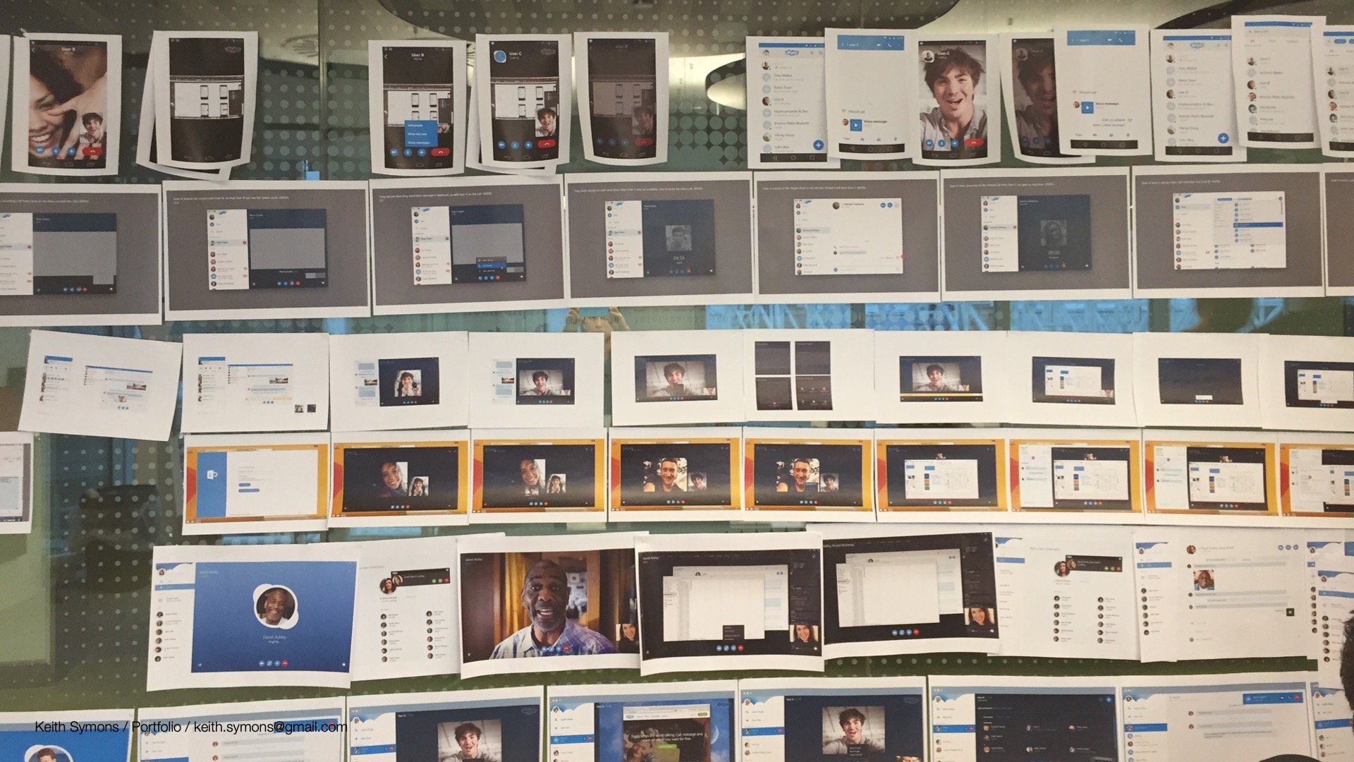
I lead the design framework project by planning a number of experience working sessions with the design and program management teams to help us understand the scale of the work and where there was room for improvement in our applications.
The typical output of the workshops were process flow diagrams, wire frames, visual and motion design, along with recommendations and next steps, to be presented to the leadership teams on a regular 6-8 week cadence.
Working sessions
Working sessions normally lasting about a week and were broken down into four main parts
Catalog & discover
Gather the raw materials from the design team, assembling screens and key flows together in a room set aside for the work.
Deconstruct & synthesize
As a team we abstracted the screens, deconstructed them to their most basic form.
Create & explore
Exploration, creating wireframes and flows for the core scenarios.
Re-construct & socialise
Put everything back together! Re-constructed and socialised the challenges, options and recommendations.
Core experiences
We decided to take on our core experiences for our first working sessions as it encapsulated our main and most well know features, i.e. Calling.
Communicating progress
Progress was communicated to senior leadership on a regular cadence and the video below whizzes through one of the many presentations we used to communicate progress to the rest of the org. Feel free to scrub through (There is no audio).
Outcome
Findings
Call controls were different across end points
The call controls are an important iconic brand moment
The icons with the strikethrough work well on desktop
Colour fill works well on desktop, tablet and mobile
We want a unified set of call controls across all form factors
Key Takeaways
Familiarity is important
Architectural hierarchy can be the same cross platform
Problem solve once, apply everywhere (e.g. the Dial pad)
Scalable and flexible, built on a single architecture
One architecture that suits both Business & Consumer (e.g. Meeting focused vs Chat)
Leveraging native patterns is equally important for creating best of class experiences
Balancing all of the above is hard
Next steps
Continue building visual specifications for common controls library
Continue visual framework integration across product ecosystem
Build new visual framework for Skype Next Generation brand/look and feel
Key findings were documented and fed back into the design and engineering teams workflows.
Skype is retiring
Sadly Skype will be retiring this May, you can read the full announcement here https://www.microsoft.com/en-us/microsoft-365/blog/2025/02/28/the-next-chapter-moving-from-skype-to-microsoft-teams/
Further Case Studies
Say hi 🤙
Product design leadership, strategy and mentoring. Find out more About me, drop me a message and send an email to keith@keithsymons.com or use this form to get in touch, I'll look forward to hearing from you. Many thanks.


